Car sale visualization ising IBMCognos & Excel
Dataset | DashboardThis is a small project to practice data visualization using Excel and IBMCognos
In the excel file CarSalesByModelEnd.exlc
- Created a Bar chart to show the Quantity Sold by Dealer ID
- Created a column chart to show the Profit by Year and Dealer ID
- Created a line chart to show the Profit of Hudson Models by Dealer ID
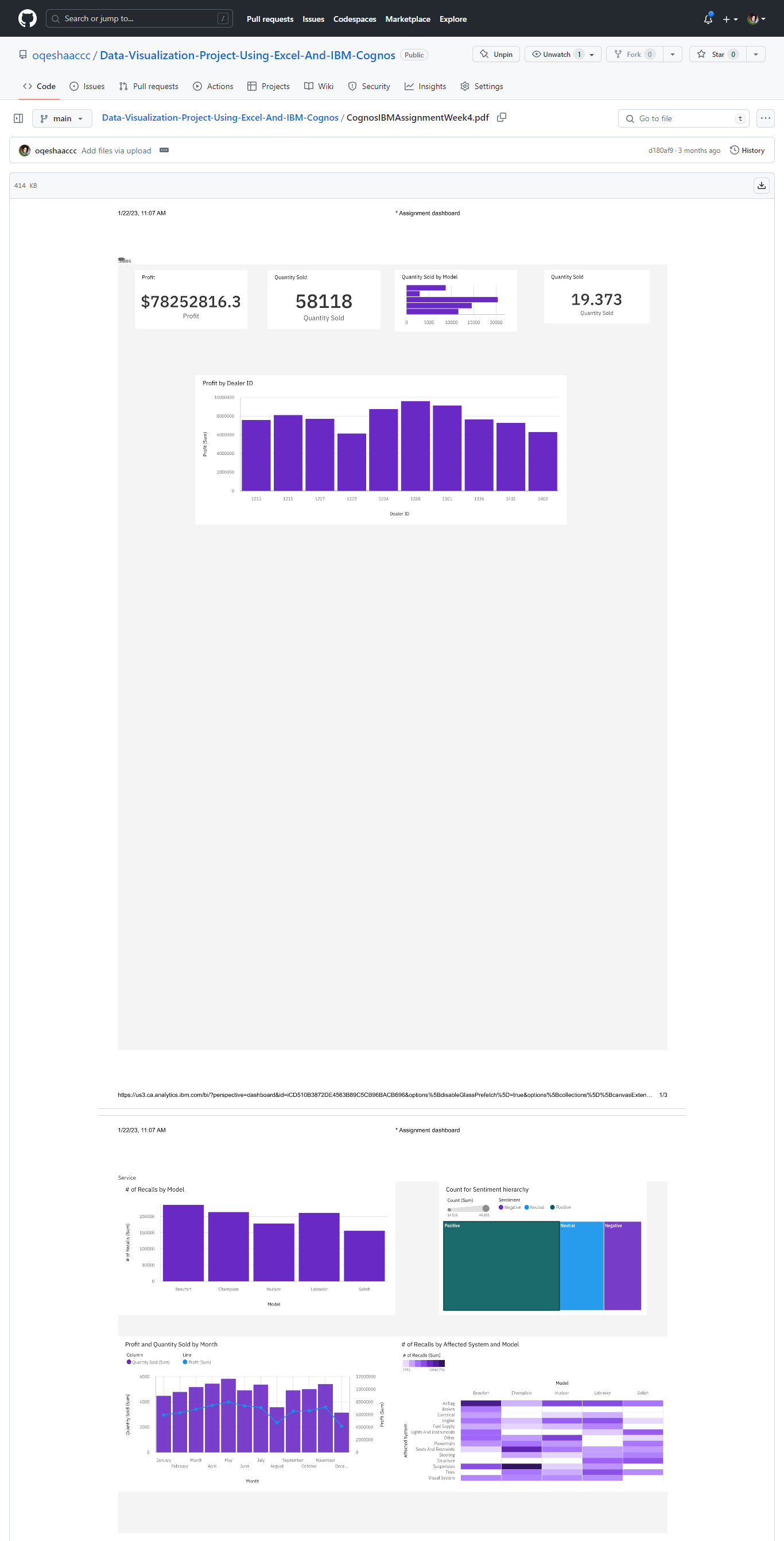
In the pdf file CognosIBMAssignmentWeek4.pdf
- Used Cognos, uploaded the excel file as a dataset
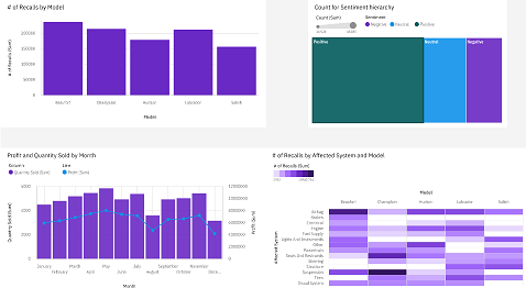
- Created two dashboard Sales and Services
In the Sales tab:
- captured Profit
- captured Quantity sold
- captured Quantity sold by model (as a bar chart)
In the Service tab:
- captured the number of recalls per model of car (as a column chart)
- captured the customer sentiment by comparing positive, neutral, and negative reviews (as a treemap)
- captured Quantity sold by model (as a bar chart)
- captured the quantity of cars sold per month compared to the profit (as a line and column chart).
- captured the number of recalls by model and affected system (as a heat map)
- exported the dashboard as a PDF file.


Back to the top